Built for the thumb
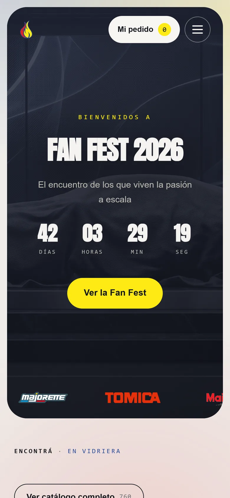
Traffic to the Fan Wheels catalog comes from Instagram: people arrive phone in hand. That's why the site was designed for the thumb first.
Where people come from
Fan Wheels sells on Instagram, and that's where it sends its followers to the catalog. Whoever lands there already has a phone in hand and a piece in mind.
So the question wasn't how the catalog looks on a big screen, but how you find one car among more than 700 without putting the phone down.
Finding without typing too much
Search understands name, brand and series, and the filters go by brand and by scale: the two ways a collector thinks about their collection.
Pagination is explicit, with numbered pages. In a large catalog, knowing which page you were on is worth more than a scroll that never ends.
44 pixels, at least
No button or link is shorter than 44 px: the size a finger hits without missing. It sounds like a detail, but it's the difference between adding a car to the order and tapping the one next to it.
A product page ready for the order
Each piece has its gallery, its availability and its specs: scale, year, series, blister and stock. Everything a collector asks before buying is already there, and the car goes into the order without leaving the page.
The order ends on WhatsApp, which on a phone is one tap away: the same place where the shop already talks to its customers.
What we took away
Designing for phones first isn't shrinking the desktop version. It's starting with the screen where people actually are, and making everything on that screen doable with one hand.
 Fan Wheels
 Franco Borthiry